

Unlock the Secrets of Forex Trading with Excel
In the realm of financial markets, where every decision hinges on precise analysis, the ability to visualize and interpret currency rate fluctuations holds immense significance. Excel, an indispensable tool for financial professionals, empowers you to unravel these intricacies with its robust charting capabilities. As you embark on this tutorial, you will discover a step-by-step guide to drawing and deciphering forex charts in Excel, equipping yourself with the insights needed to navigate the dynamic forex market successfully.

Image: williammrodden.github.io
Defining Forex Charts
A forex chart is a graphical representation of currency value fluctuations over time. By plotting exchange rates along two axes, traders can track price movements and identify potential trading opportunities. Forex charts display various periods, ranging from short-term intraday movements to long-term historical trends.
Creating Forex Charts in Excel
-
Import Forex Data: Import historical or real-time exchange rate data into an Excel spreadsheet using reputable providers like Yahoo Finance or Google Finance.
-
Select Chart Type: Navigate to the “Insert” tab and choose the desired chart type. Line charts are commonly used for forex visualization, but you can explore other options like candlestick, bar, or area charts.
-
Assign Rate Data: Select the exchange rate data you wish to chart. Assign “Date” or “Time” values to the X-axis and the exchange rate values to the Y-axis.
-
Adjust Settings: Customize the chart elements such as colors, line thickness, and axis labels. Add trendlines, moving averages, or other technical indicators to enhance analysis.
Advanced Charting Techniques
-
Overlaying Multiple Charts: Compare different currency pairs or time frames by overlaying multiple charts in one worksheet.
-
Technical Analysis: Leverage technical indicators like Bollinger Bands, RSI, or MACD to identify trends, momentum, and trading signals.
-
Custom Indicators: Create your own formulas or import existing indicators to enhance chart functionality and gain a unique perspective on the market.
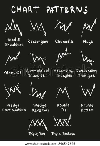
Image: www.shutterstock.com
Tips and Expert Advice
-
Use a High-Resolution Monitor: A large screen provides a clear view of complex chart patterns.
-
Regularly Update Data: Ensure your charts reflect current market conditions by updating data frequently.
-
Consider Multiple Time Frames: Analyze charts across different time frames to gain insights into short-term fluctuations and long-term trends.
FAQ
- Q: What is the best chart type for forex trading?
A: Line charts are popular for displaying exchange rate changes, but candlestick or bar charts provide additional insights from price action patterns.
- Q: Can I create my own technical indicators in Excel?
A: Yes, Excel allows you to create custom formulas to calculate technical indicators tailored to your specific trading strategies.
- Q: How often should I update my forex charts?
A: The frequency of chart updates depends on your trading style. For intraday traders, real-time updates are crucial, while long-term investors may prefer weekly or monthly refreshes.
How To Draw Forex Charts In Excel
Conclusion
Navigating the forex market demands a keen eye for detail and the ability to interpret market movements. By mastering the art of drawing and analyzing forex charts in Excel, you empower yourself with the tools and insights needed for informed trading decisions.
Whether you are a seasoned trader or just starting your forex journey, excel your trading strategy by incorporating these powerful charting techniques. Stay ahead of the curve, optimize your trades, and conquer the dynamic world of forex markets.
Are you ready to unlock the secrets of forex charting in Excel? Embark on this transformative journey today and elevate your trading game to new heights!


